

Communication through visual design occurs on many levels, some more obvious than others. Moviegoers will watch a horror film and see images expected of the genre— decrepit old buildings, a full moon, and rampaging monsters or ghosts. Storylines are generally ubiquitous as well with protagonists being somehow victimized by a malevolent force and fighting to overcome the evil.
For this reason, the success or failure of a film (and particularly a horror film) depends on how well the director tells the story.
One director whose work I admire is John Carpenter and though he is more commonly recognized for films like Halloween and The Thing, I have always been fascinated by his 1987 release Prince of Darkness. Though it was critically panned following its release and is generally not considered one of Carpenter's more successful films, there are some (including myself) who believe it is greatly underrated and unappreciated.
For readers who are unfamiliar with this movie, I suggest reading a full plot synopsis or better yet just watch the film! I am not going to dissect and fully analyze the story point-by-point. Rather, I want to discuss a few examples of how the visual design of the film enhances the story.
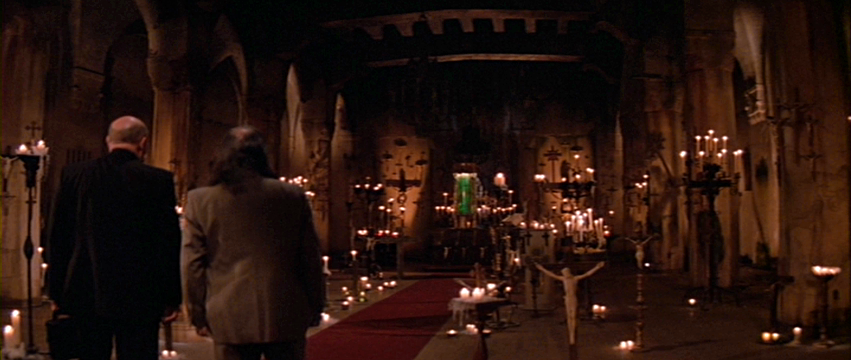
The establishing shot giving viewers the first glimpse of the enemy contains several common compositional elements: 1) foreground-middle ground-background, not only lending a greater sense of depth to the shot, but emphasizing a proximal relationship of the viewer to the actors and a much more distal relationship to the mysterious canister of glowing green fluid. As more is revealed and understood about the canister, shots move much closer to the substance. 2) vectors create perspective lines leading the eye of the viewer to the subject of the shot. In this case, the candles, the columns and archways, even the edges of the red carpet, all draw our eye straight to the canister. 3) frame within a frame is sometimes very subtle, but nonetheless keeps the viewer focused on the emphasis of the shot. The term could refer to a single nested frame within the picture frame itself, or to many framing elements within a single shot. Here, the canister is framed between two candelabras, as well as between the two shafts of uplighting on the back wall, and even between the corners of the wall itself.
 |
| Frame within a frame locks focus on the subject |
Another element sometimes missed by the conscious mind of the viewer is color. Take the above-mentioned shot for example. Primarily, the palette here is gold, red, and green. Why is it important to notice this? Because we see it again later in this shot:

Compare the gold of the ambient light on the walls of the cathedral to the gold of the tile and wall behind Professor Birack. We have red carpet down the center aisle and the red of the professor's leather chair. Finally, we have the swirling green liquid in the cylindrical glass canister and a green thermos on the desk between Birack and The Priest.
The action has physically relocated from the old abandoned sanctuary to the much cozier and safer setting of an office, but the threat of the basement cathedral is still very present and this is established through the relationship of color.
Further, observe this subsequent shot in the same setting:

In the scene, Birack and The Priest are attempting through intellectual conversation to understand the nature of the enemy force in the basement. On one side, academic reasoning and scientific method. On the other, spirituality and mystical religion. Yet poised in the center of the two is a green cylindrical container. Perhaps the truth lies somewhere in the middle between science and religion?
Even here, later on, back down in the basement a similar shot composition echoes this polarization between truth-seeker Brian and skeptic Walter. Yet always present both in the background and at the center of it all is the green fluid. Color also comes back into play here, not just the established palette of the room but observe the wardrobe of the characters. Brian, who is bright, open-minded and actively pursuing an understanding of the primordial fluid stands out against his surroundings because of his light blue shirt. Whereas Walter who complains about the research project, doesn't appear to take much seriously, and remains adamantly skeptical of the emerging truth about the liquid is drab, just like his shirt.

Professor Birack theorizes the real force at work in the story is an Anti-God who exists in much the same way physical particles have anti-particle counterparts, matter and anti-matter, mirror images. How does a film director convey such a scientific concept to a general audience not completely made up of physicists? Like this:

We first see the possessed and transmuted character of Kelly drawn to a small compact mirror. As she attempts to reach through to the "mirror" realm, the tiny mirror proves too small a portal. Shortly thereafter, she finds a much larger wall mirror which quickly becomes a passageway into the world behind the mirror, the anti-world.

And yet here we see from inside the mirror world, our outside world becomes the mirror, the opposite. So visually we see and understand Birack's assertion of how two things co-exist at a common point, yet each opposite to the other...its mirror image.
And so what does an evil, self-aware entity composed of people-possessing primordial fluid reach for through the mirror?

That would be the Anti-God. If ever there was a hand of an evil demon...yikes!
And it is the depiction of this Anti-God that brings me to the final segment I wish to discuss. It is stated in the film that everyone in close proximity to the church has the same dream and it is later surmised by Birack and Brian that the dream is actually a looping video transmission from the future made viewable through sub-atomic particles traveling faster than light (or backwards in time).

Because of this earlier shot (above) of the front entry of the abandoned church seen through the fence with the statue in the foreground, we can immediately recognize the location of the transmission or "dream" before we even understand what it is.

The director has visually tied together two shots occurring far apart in the film (both linearly and temporally) through very similar composition.
There is an as-yet inexplicable quality to the dream footage that I have not been able to fully deconstruct, but for some reason ever since first seeing the film nearly thirty years ago, this segment has always been particularly chilling to me. There is an almost hyper-real and sublime quality to it. The voice-over in the transmission (provided by John Carpenter himself according to fan site jcpod.net) tells us it is not a dream, but the transmission is being received as a dream due to the broadcaster's inability to "...transmit through conscious neural interference."
Though I suspect other more subtle psychological factors are at play in this sequence, there are a couple of visual storytelling devices to point out, namely color and light.

We've established viewers recognize this as the front of the abandoned church, specifically outside the church. In other words, this is the world we know. Now we see emerging from within a tall, silhouetted figure. At this point in the film, viewers have not seen what is trying to come into our world from the mirror-world. But as seen in this "message from the future," something physical and even humanoid is clearly going to walk out of that church.
In terms of lighting, the visibility of the church exterior suggests sunlight and daytime. The interior of the church is not visible through the doorway because of the interior light source and the physical features of the figure are not visible because it is both still in the dark and back-lit.
The lighting conditions then bring with them an interesting juxtaposition of color temperature. Outside we see the warm reddish oranges and yellows of the brick facade. In contrast, we see inside the coldness of the deep blue light and the dark void of the figure moving forward.
Generally speaking, within horror film and literature especially, evil things dwell in the darkness and daylight means safety. But here we encounter what is presumably this Anti-God, this Prince of Darkness, about to walk right out of the cold dark into the warm light, a demon emerging from a church.
Opposites converge. The mirror shatters. And we are no longer safe in the light or anywhere else. All comfort and reassurance is stripped away in the matter of a few seconds of scratchy video footage.
This is the beauty of the medium. Through composition, lighting, color, and many other visual storytelling elements, a director can to a large extent manipulate and guide the audience through the experience of the film.
Through the design of the film, the story is told on many levels, whether the viewing audience is consciously aware or not.
I once heard Steven Spielberg advise a group of film students to watch movies with the sound turned off. He said if the story is clear through the imagery alone, it is a well-directed film.
Probably not everyone can enjoy an entire film without audio, but hopefully some readers will now watch movies with a little more awareness of what good directors are saying about the story through the moving images...
...and how they're saying it.
Happy Halloween, everyone!

-DLA


